Understanding the anatomy of the page will help you to discuss your needs with your web developer but also assist you to author beautiful content.
Anatomy of the Page
Header and Subheader
The image below is numbered to indicate different parts of the standard webpage.
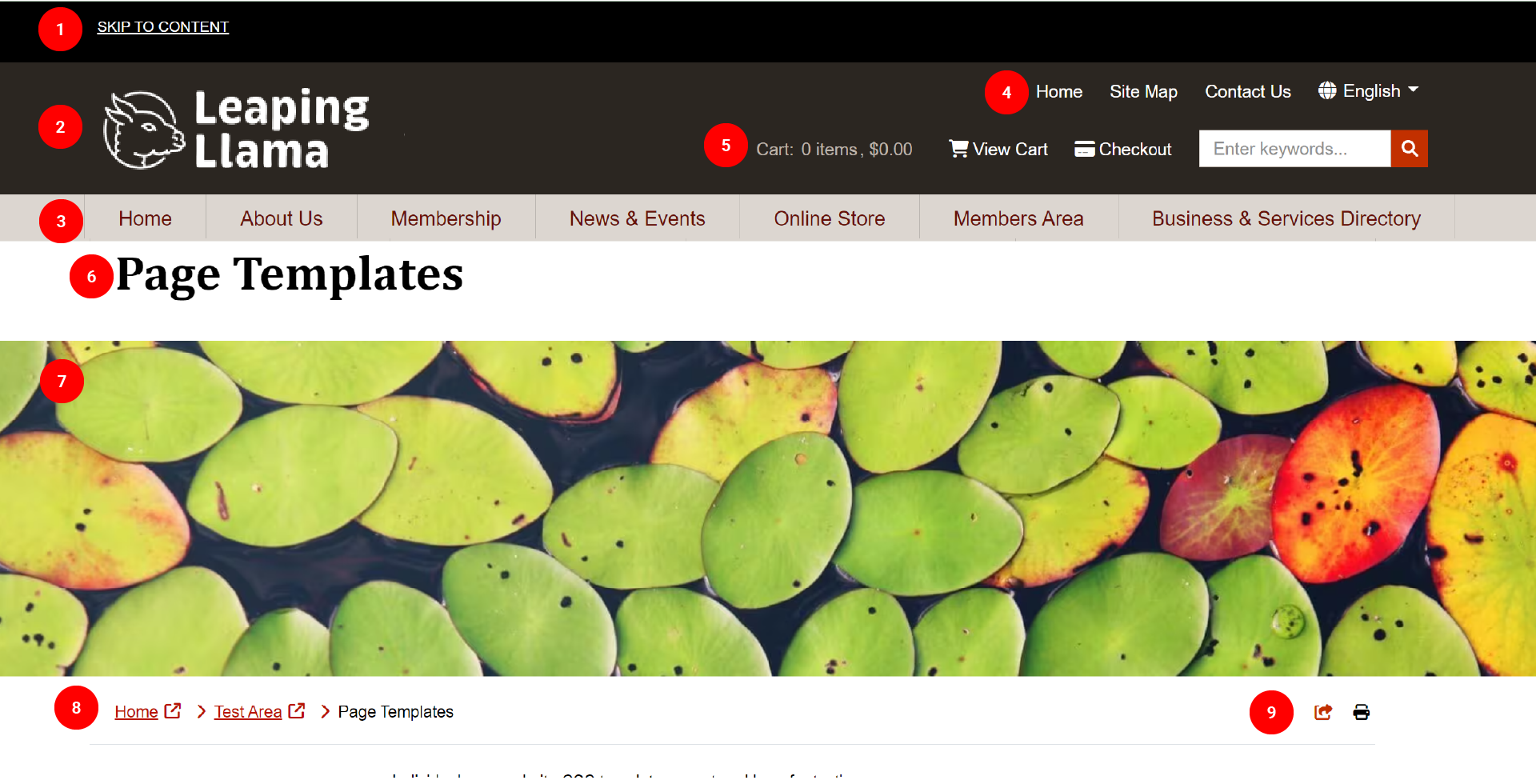
Items 1-5 in the image above collectively are the Header area of the website. Items 6-9 are the Subheader area.
- Accessibility bar - this is not visible on all sites but can include the skip to content link and other quicklinks and tools
- Site Logo - all sites have the brand logo represented
- Main Menu - there are different formats for this primary navigation tool including simple lists, megamenu or hamburger with or without drill down. The format may change with the device type that the website is displayed with.
- Anchor Menu - this is the secondary navigation for the site with quicklinks to the most important user actions. This can commonly include login, search, contact us
- Extended Anchor menu - sometimes the anchor menu extends over two lines particularly for member or ecommerce sites.
- Heading 1 - the page's primary heading is often but not always included in the subheader of the page
- Sub header image - often but not always the subheader includes an image. The authoring of this image changes depending on the page template, it can come from a subheader widget, the page summary image, main image or other image.
- Trail navigation (or breadcrumbs) - This usability feature allows site users to see where they are and easily navigate in the part of the content tree they are currently in.
- User tools - can include e.g. share, print, font size tools
Area SubMenu
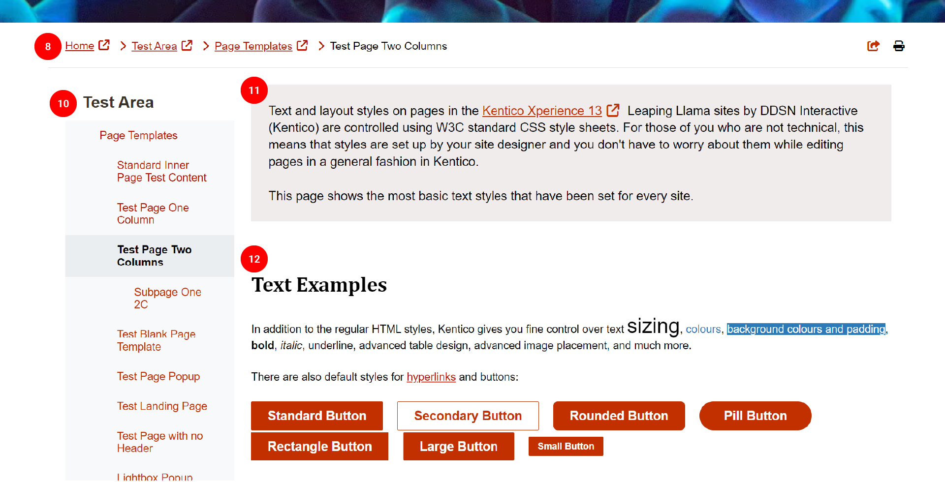
The image below is numbered to indicate different parts of the standard webpage.
- This area of the website is present in some page layouts, it holds the navigation as a list /sublist for the current section of the site that the user is visiting.
Primary Content Area
This area of the webpage holds the bulk of the page content and may include;
- Summary text - this text comes from the summary text field on the content tab and is styled as a feature of the page.
- Primary content area - Normally this will begin with a Heading at the Heading level 2 in the hierachy.
Secondary Content Area
This area of the webpage may or may not be used. It may be located at the bottom of the page just above the footer or to the right of the primary content area, depending on the page layout in use.
Tertiary Content Area
This area of the webpage may or may not be used. It may be located at the bottom of the page just above the footer, depending on the page layout in use.
Footer
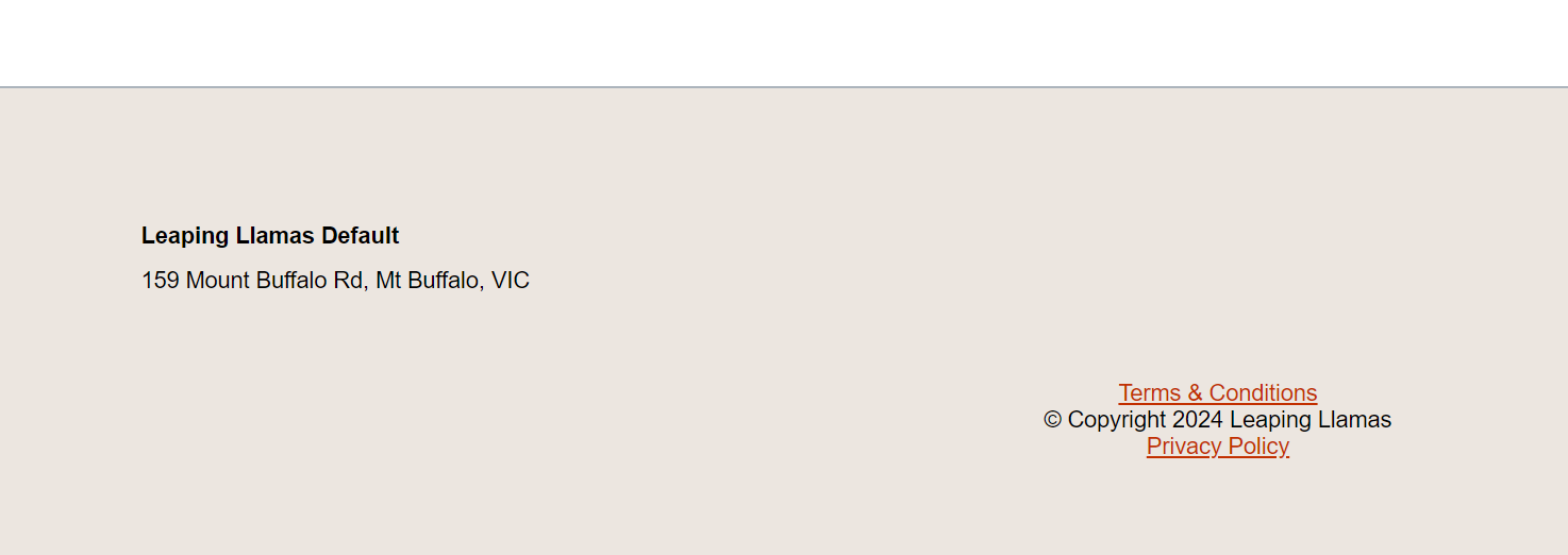
This is located at the bottom of the page and is normally the same right across the site. It contains a brief sitemap, policies & information pages, contact information and business information as well as information for the company that is maintaining the site. A very simple example is pictured below.
The Authoring interface
In the Kentico admin the page tab displays a WYSIWYG 9what you see is what you get) view for most items, and whilst it is not an exact replica of the final layout it provides a very good indicator. What you will see are the sections of the site with named with indicator bars to aid in your content preparation. This is pictured below for the One Column Layout.
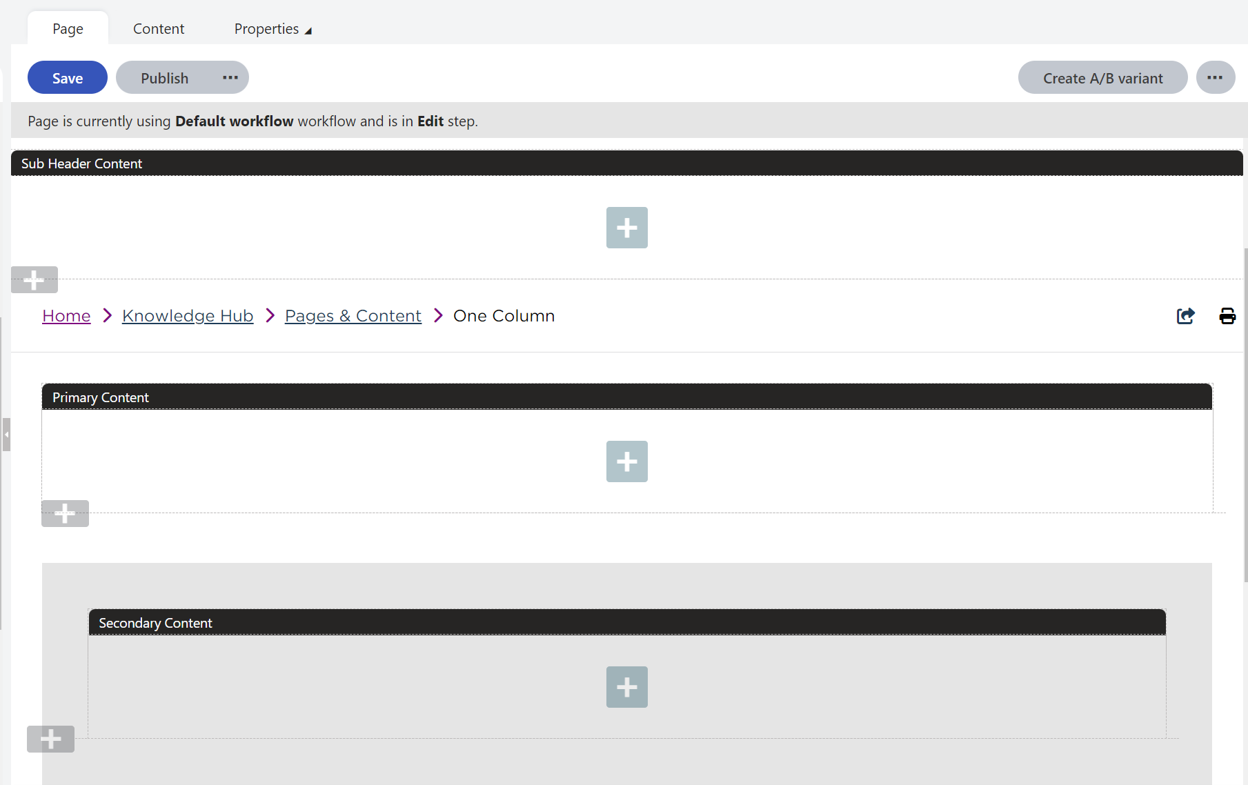
The plus symbol in the blue-grey square located in the centre of a content section allows the addition of a widget. Clicking on the plus symbol opens a pop-up window that has a listing of the widgets.
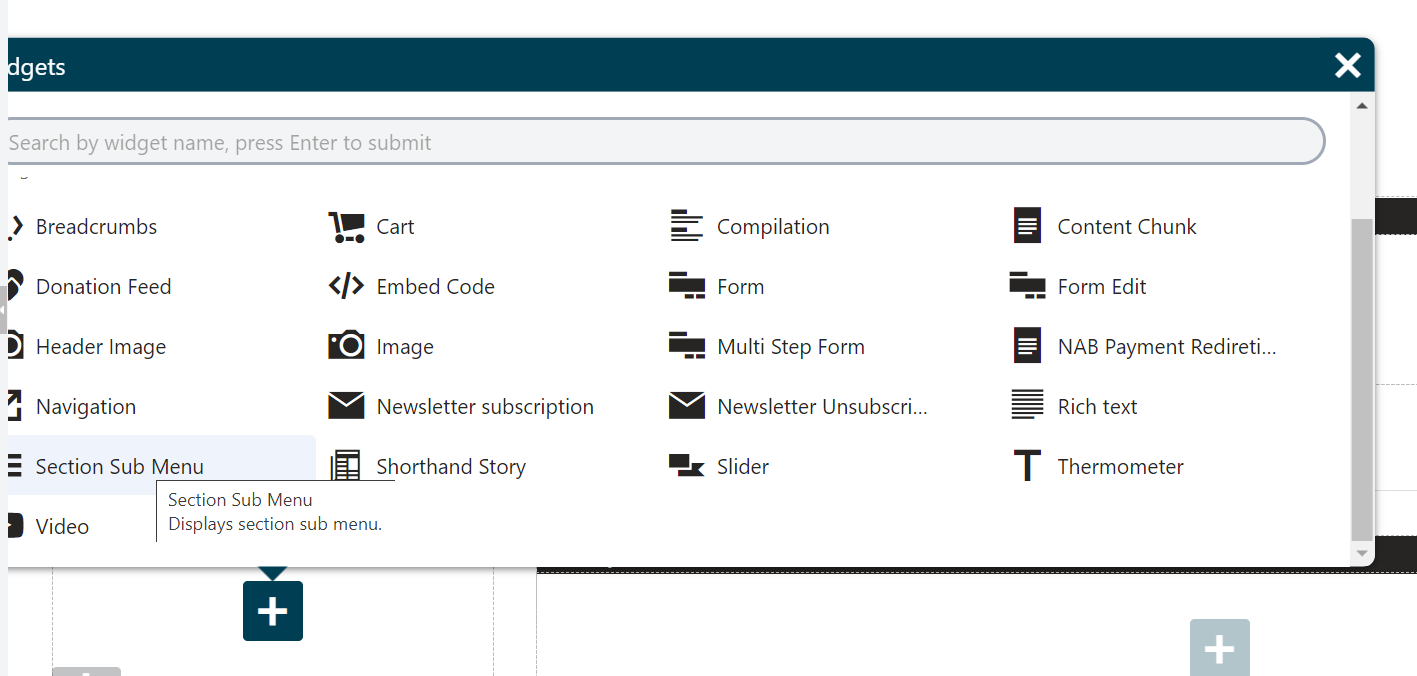
Once you commence authoring the top of the widget list are two additional sections that appear at the top of the widget selection interface
- Copied widgets - this is a growing list of widgets that you have copied. A copied widget remembers all the settings that are used in that widget at the time it was copied.
- Recently used widgets - this list populates automatically as you author. Widgets in this section have default settings for the widget.

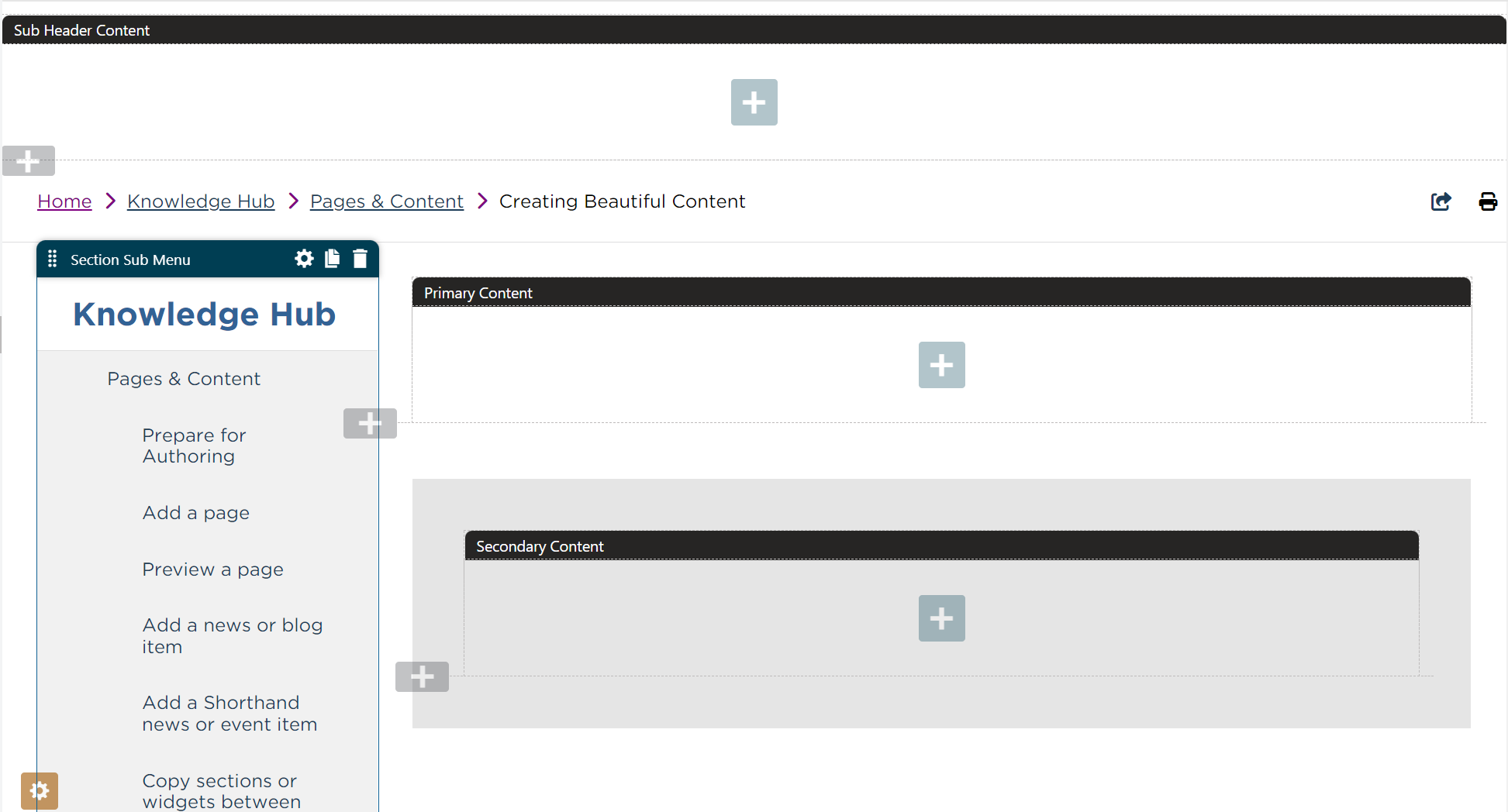
The Layout of the page can be changed by selecting the Cog at the bottom left of the Page Tab interface.
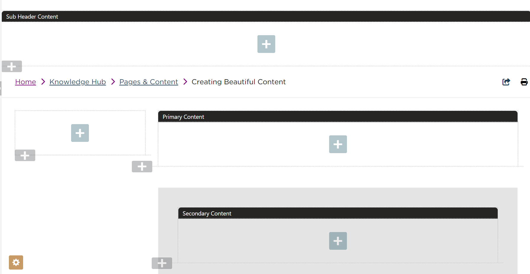
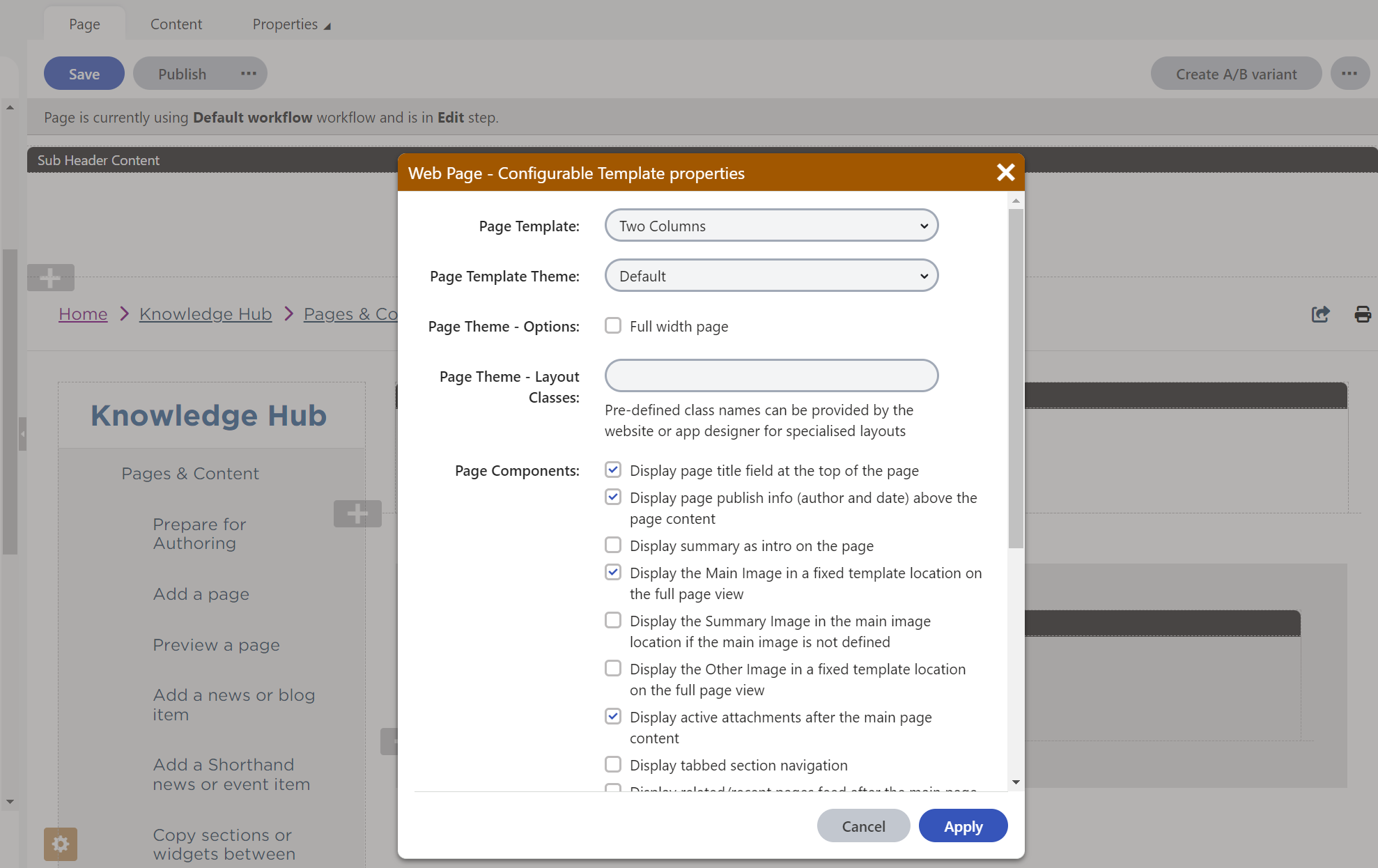 Pictured below is the Two Column Layout.
It has an extra column that is normally on the left, but it may be on the right hand side for some designs.
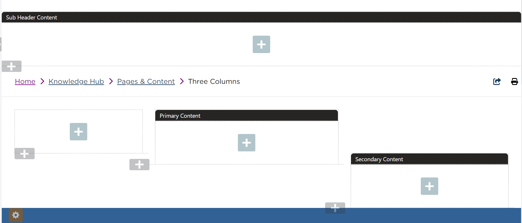
-
Pages & Content
- Prepare for Authoring
- Navigating the Pages Interface
- Add a page
- Preview a page
- Creating Beautiful Content
- Add a news or event item
- Publish a page
- Copy sections or widgets between pages
- Update the header image of a page
- View the code of a page
- Add a summary paragraph to the top of a page
- Insert an anchor on a page
- Add a Shorthand news or event item
- Email Marketing
- Dashboard & Functions
- Client Knowledge
